01
Overview
Intro
Table of contents
The pricing page is one of the most important pages of any website as it is the ultimate defining moment of a company success. Deputy's one was well... far from great. Not only from a visual design perspective but, especially, in terms of Information Architecture.
Through thorough UX investigations and collaboration with an all-start team, we managed to increase the page's sign up rate by a juicy 1.9%.
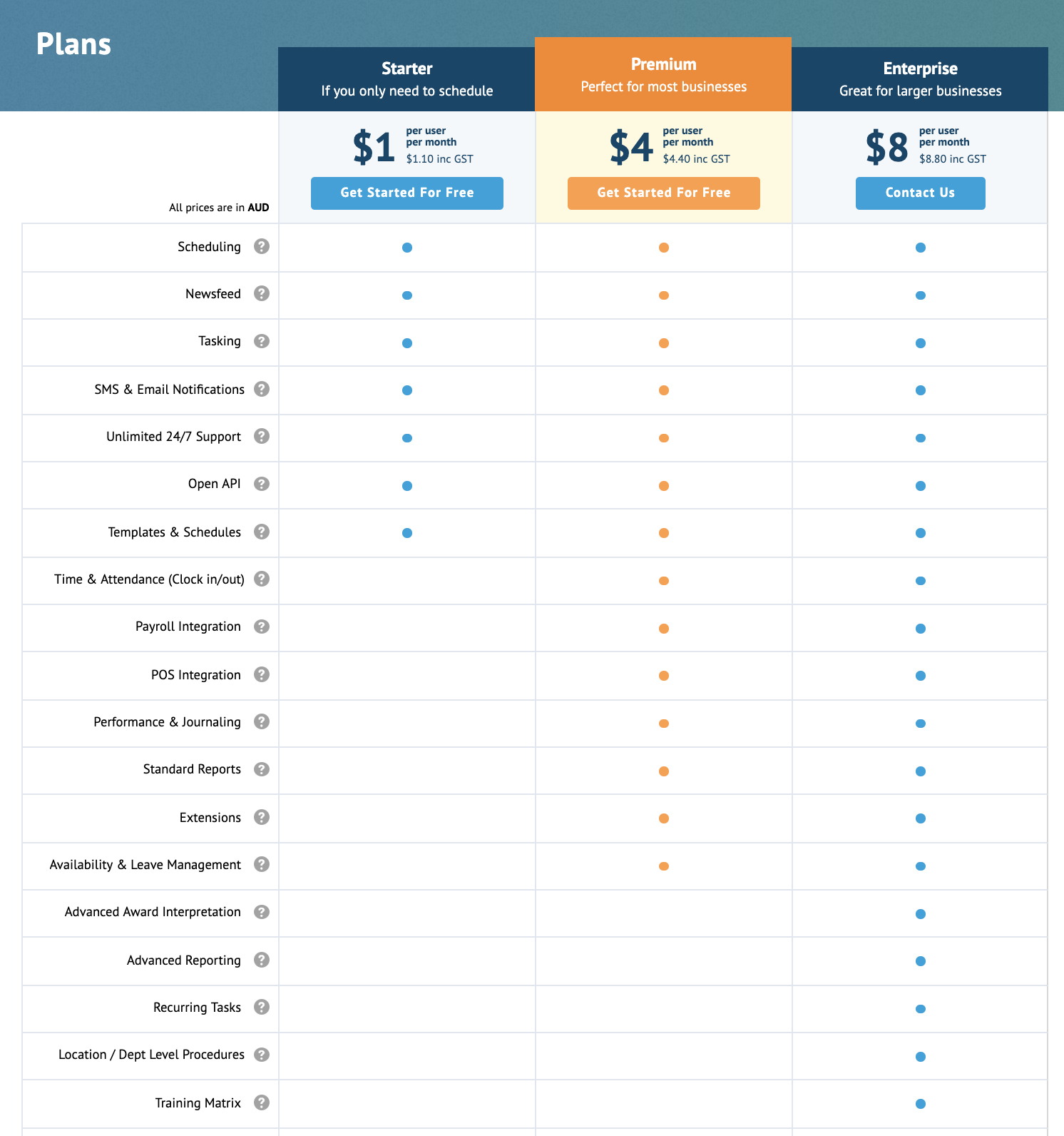
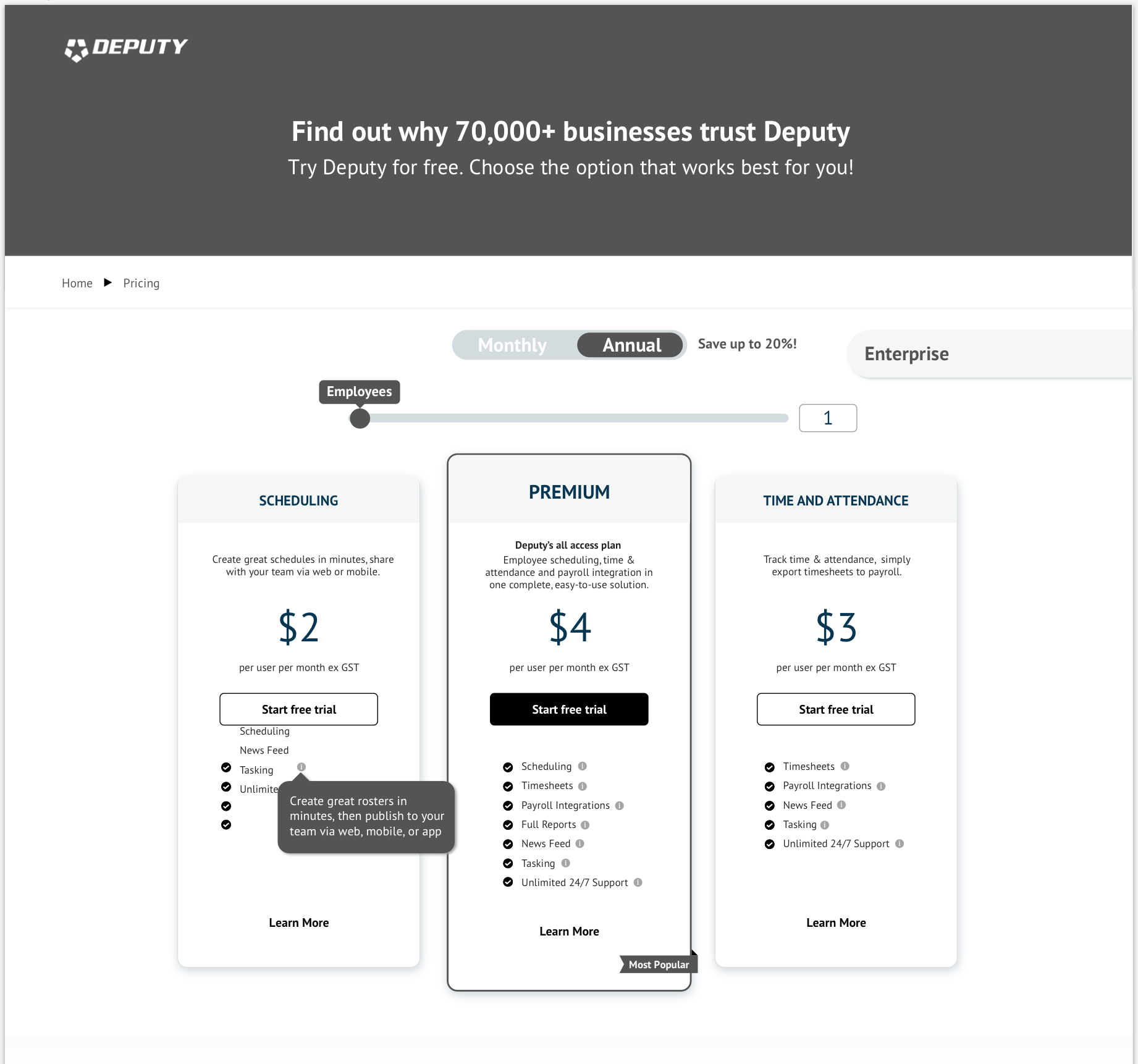
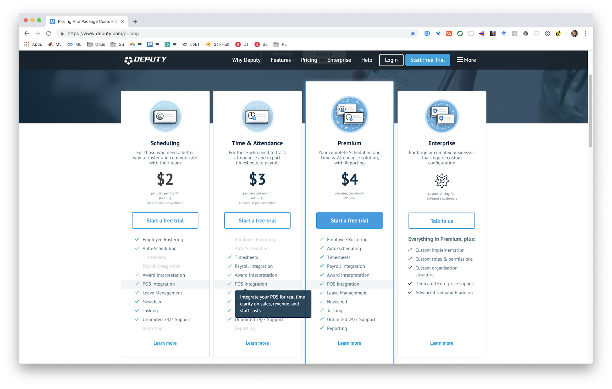
The sales team reported that customers were confused by the pricing page and couldn't understand the information as displayed. Also, the pricing page looked like 👇
Structure
- H1 Summary
- H1 Problem
- H1 Team
- H1 Process
- H3 Wireframes
- H3 User testing
- H3 Synthesis
- H3 A/B testing
- H3 Polished design
- H1 Results
- H1 Continuous improvement
Table of contents
Summary
The pricing page is one of the most important pages of any website as it is the ultimate defining moment of a company success. Deputy's one was well... far from great. Not only from a visual design perspective but, especially, in terms of Information Architecture.
Through thorough UX investigations and collaboration with an all-start team, we managed to increase the page's sign up rate by a juicy 1.9%.
Problem
The sales team reported that customers were confused by the pricing page and couldn't understand the information as displayed. Also, the pricing page looked like 👇
Team
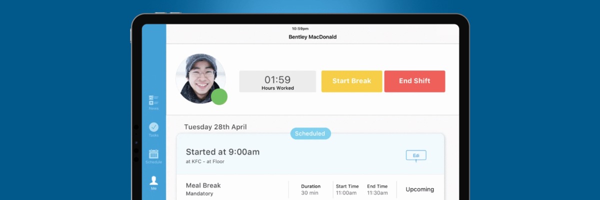
For the pricing page I was the main UX Researcher in the discovery phase, taking direction from our Head of Experience. I designed the wireframes, and coupled with our Digital Designer to transform them into polished design for handoff to our Web Developer. I transformed the illustrations into CSS animation.
Process
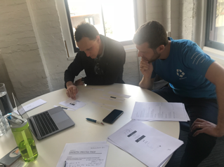
We started off with stakeholder interviews, competitor analysis, and SaaS benchmarking, and learnt a ton of (super-secret) previous learnings, allowing us to draft out hypothesis on how the page ought to be.
Wireframes
User testing
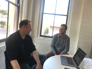
We tested wireframes with prospects to validate our hypothesis.
Synthesis
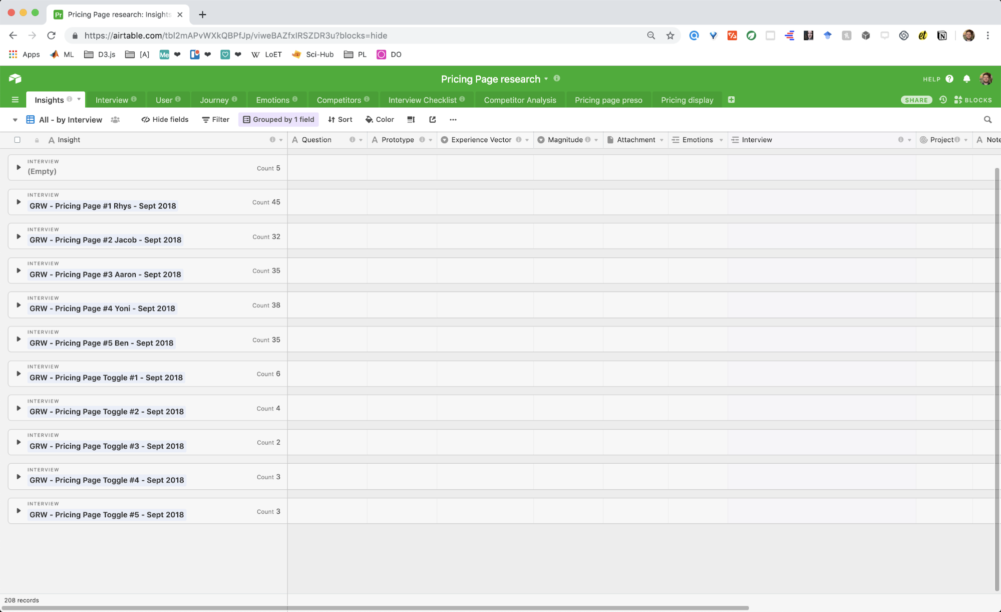
For the synthesis, I have adopted Tomer Sharon's beautiful Airtable model, removing some elements I judged as unnecessary and adding others that were lacking. Due to sensitive data, I can only show what the skeleton looked like but it'll be up to readers to imaging its contents. If you'd like to hear more about how we used Airtable you can drop me an email.
A/B testing
Finally we A/B tested what we thought were the most suitable designs fitting our learnings.
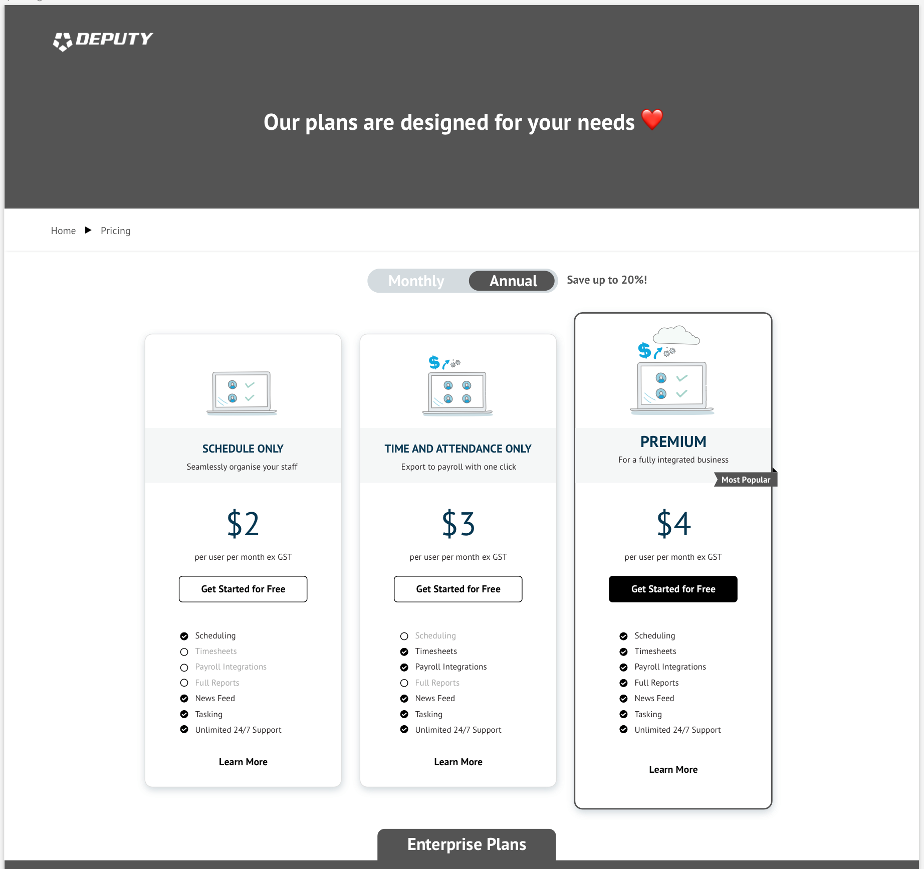
Polished design
Results
We increased SignUp rate by a juicy 1.9%
Continuous improvement
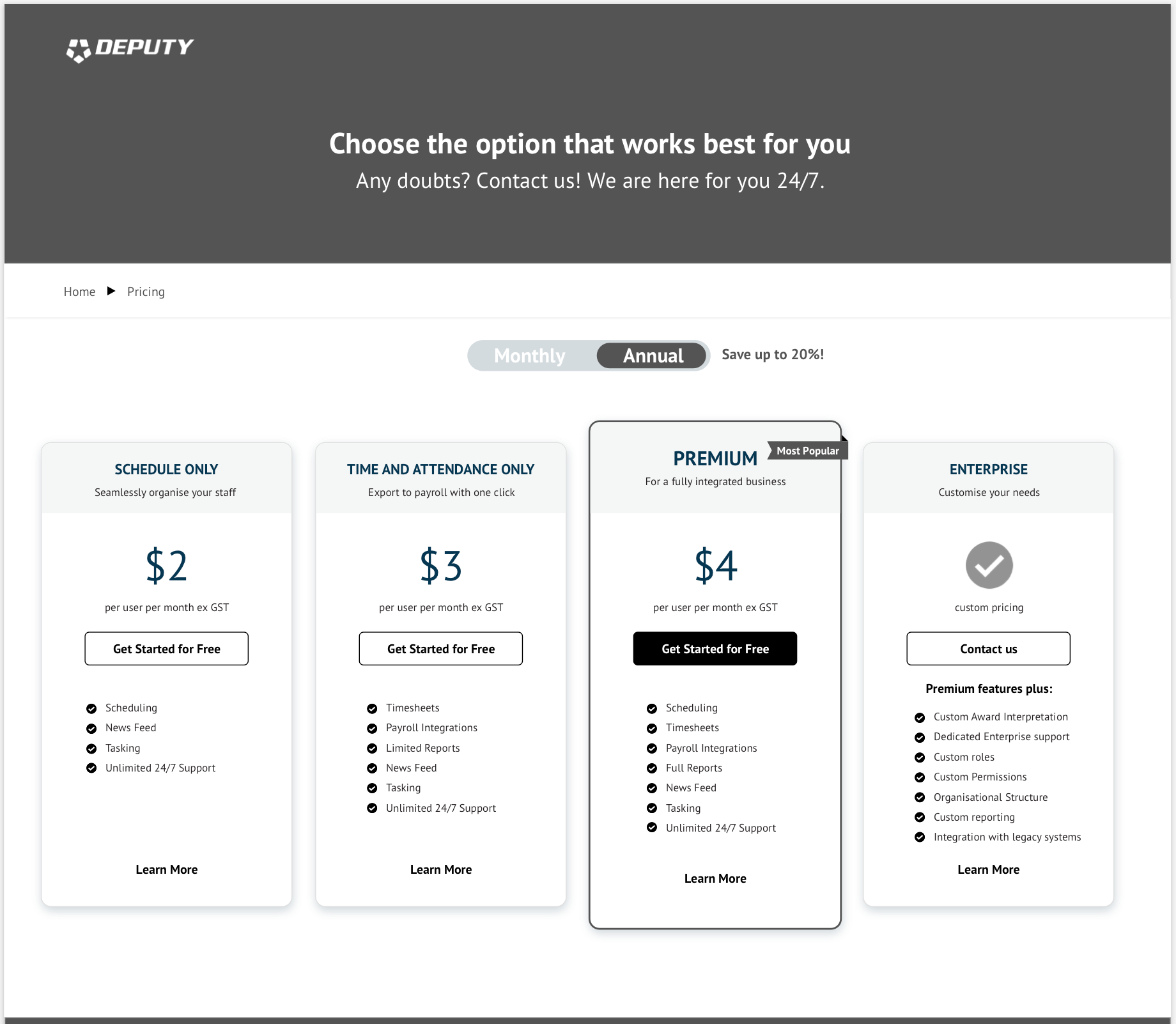
Without ever giving up on improvement, because as we say at Deputy, perfect is bullshit, the pricing page keeps on evolving as new possibilities emerge. Below is the actual page as it is today.
03